4. Flutter
Flutter is a framework for building natively compiled applications for mobile, web, and desktop from a single codebase. It allows you to create beautiful and fast apps with ease.
To start using Flutter on your computer, follow the installation guide provided in the official Flutter installation documentation. This will walk you through installing Flutter on your machine and setting up the necessary tools.
If you don't have the necessary permissions to install Flutter locally, you can quickly start coding with Flutter in the cloud using Zapp. This platform lets you write, run, and test Flutter apps directly from your browser.
4.1 Your First Flutter App: "Hello, World!"
Here’s how to create your first Flutter app that displays "Hello, World!" on the screen.
-
Create a New Flutter Project
- If you're working locally, run
flutter create hello_worldin your terminal. This creates a new Flutter project. - If you're using Zapp, just open the editor and replace the existing code with the following.
- If you're working locally, run
-
Replace the Default Code with:
import 'package:flutter/material.dart';

void main() {
  runApp(MyApp());
}

class MyApp extends StatelessWidget {
  @override
  Widget build(BuildContext context) {
    return MaterialApp(
      home: Scaffold(
        appBar: AppBar(
          title: Text('Hello World in Flutter'),
        ),
        body: Center(
          child: Text('Hello, World!'),
        ),
      ),
    );
  }
}
-
Run the App
- If you are running it locally, use
flutter runin your terminal. - In Zapp, simply hit the
Runbutton to see the output.
- If you are running it locally, use
Explanation
MyApp: The main widget that runs the app.MaterialApp: A wrapper widget that applies Material Design to your app.Scaffold: Think of this as the basic structure of a page, like a template.Center: A widget that centers its child widget on the screen.Text: Displays the text "Hello, World!" in the center of the screen.
Widget
In Flutter everything is a widget. Widgets are immutable, meaning they don't change themselves. So when the UI needs to be updated (for example, after a user interaction), Flutter calls the build method to rebuild the widget and display the updated UI.
first app: AppBar
Change the title in the AppBar.
first app: Text
Change the text shown to the user.
You can style your text using TextStyle, e.g.
Text(
'Hello World!',
style: TextStyle(
  fontWeight: FontWeight.bold,
  fontSize: 24,
  color: Colors.red,
  backgroundColor: Colors.grey,
  )
)
TextStyle
Change the font size and color of your text.
4.2 Stateful Widgets and Interaction
In Flutter, state refers to data or information that can change in your app. Think of it like the current situation or status of something in your app. For example:
- A button that changes color when pressed
- A counter that increases every time you press a button
In Flutter, we have two types of widgets
- Stateless Widgets: These are like pictures. They don’t change.
- Stateful Widgets: These are like a clock showing the current time. They can change over time.
4.2.1 Counter App
Now, let’s build a Counter App where a number increases every time the user presses a button.
Here’s the full code with comments explaining what’s happening:
import 'package:flutter/material.dart';

void main() {
  runApp(const MyApp());
}

class MyApp extends StatelessWidget {
  const MyApp({super.key});

  @override
  Widget build(BuildContext context) {
    return MaterialApp(
      title: 'Demo Flutter App',
      theme: ThemeData(
        colorSchemeSeed: Colors.orange,
        useMaterial3: true,
        brightness: Brightness.light,
      ),
      darkTheme: ThemeData(
        colorSchemeSeed: Colors.purple,
        useMaterial3: true,
        brightness: Brightness.dark,
      ),
      home: const CounterPage(title: 'Counter Example'),
      debugShowCheckedModeBanner: false,
    );
  }
}

// MyApp is a StatefulWidget because its counter can change
class CounterPage extends StatefulWidget {
  const CounterPage({super.key, required this.title});
  final String title;

  @override
  State<CounterPage> createState() => _CounterPageState();
}

class _CounterPageState extends State<CounterPage> {
  int _counter = 0; // This is our counter (starts at 0)

  void _incrementCounter() {
    // setState triggers a rebuild of the widget tree,
    // i.e. it calls the build method
    setState(() {
      _counter++; // Increase the counter by 1
    });
  }

  @override
  Widget build(BuildContext context) {
    return Scaffold(
      appBar: AppBar(
        title: Text(widget.title),
      ),
      body: Text(
              '$_counter', // Show the counter value
            ),
      floatingActionButton: FloatingActionButton(
        onPressed: _incrementCounter, // Call the method to increase the counter when pressed
        tooltip: 'Increment',
        child: const Icon(Icons.add),
      ),
    );
  }
}
Copy the code into Zapp and run it.
Explanation of the Code
MyAppis the root of our application. Here we define the theme and what to show at start up.CounterPageis a StatefulWidget because the app has a changing value (the counter). AStatefulWidgetis like a person with a changing mood. The widget can update its state (mood) whenever needed, and Flutter will rebuild the UI to reflect the new mood._CounterPageStateis where the state ofCounterPageis stored. In our case, the state is the counter value, which starts at 0.- The
setState()method is like telling Flutter that something has changed (like saying, "Hey, the counter just went up!"). When you callsetState(), Flutter knows it should update the screen to show the new counter value. - The
build()method defines the UI, which is the visual part of your app. It says, "Here’s what the screen looks like!" - The
FloatingActionButtonis the button you press. Every time you press it, it calls_incrementCounter(), which updates the counter.
layout
Make the app nicer, e.g. place the text widget into a center widget
Center(
    child:Text($_counter')
),
Behavior
Initialize the counter with a start value of 10. Increment the counter by 10. Note: _counter++ is a shorthand for _counter = _counter + 1;
Theme
Change the seed color of your counter app.
if
Print a message when the counter exceeds 50.
else
Stop counting once the counter reaches 50.
Instead of printing to the console, which is only visible to the developer, display a snack-bar notification:
final snackBar = SnackBar(
    content: const Text('hi'),
);
ScaffoldMessenger.of(context).showSnackBar(snackBar);
You may add a second button using
body: Column(
  children:[
    Text('$_counter'),
    ElevatedButton(onPressed: _actionSecondButton,
    child: const Text('Second Button')),
  ])

// ToDo implement method _actionSecondButton
4.2.2 Widgets
In Flutter, everything you see on the screen is a widget. Think of a widget as a building block or a part of the user interface (UI). Widgets can be things like buttons, text, images, or entire layouts.
Widgets are like the ingredients of a recipe. When you combine them in different ways, you create your app’s interface.
For example
- A Text widget shows some text on the screen.
- A Container widget is like a box that can hold other widgets, and you can customize it with colors, padding, margins, etc.
4.2.3 Simple Widgets
The Text widget is one of the simplest and most commonly used widgets in Flutter. It simply displays a string of text on the screen.
Text('Hello, Flutter!')
This displays "Hello, Flutter!" on the screen.
4.2.4 Container Widget
A Container is a flexible and powerful widget. You can think of it as a box that can hold other widgets. You can add things like
- Padding (space around the content inside the box)
- Margin (space around the box itself)
- Color (to give the box a background color)
- Width/Height (to control the size of the box)
Container(
  color: Colors.blue,
  padding: EdgeInsets.all(16),
  child: Text('This is inside a container'),
)
Here, the Text widget is placed inside the Container widget. The Container adds some padding and a background color around the text.
4.2.5 Nested Widgets
In Flutter, widgets can be nested inside each other, similar to Russian nesting dolls (Matryoshka dolls). Just like how one doll fits inside another, each Flutter widget can contain other widgets within it, allowing you to build more complex UI layouts.

For example, a Column widget might contain several Text widgets inside it, just like how a larger Russian doll can house progressively smaller dolls within it. This nesting structure helps you create hierarchical, layered designs, where each widget is responsible for a particular part of the layout. And just like the dolls, each widget can be independently customized and reused as needed.
Example of nesting:
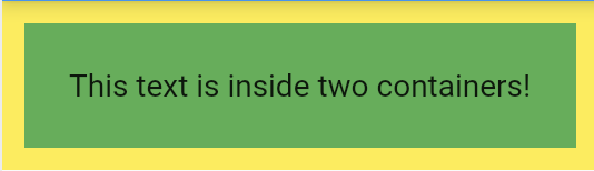
Container(
  color: Colors.yellow,
  padding: EdgeInsets.all(10),
  child: Container(
    color: Colors.green,
    padding: EdgeInsets.all(20),
    child: Text('This text is inside two containers!'),
  ),
)
4.2.6 Rows and Columns
When building layouts, you often need to arrange widgets in a line (horizontally or vertically). This is where Row and Column widgets come in.
4.2.6.1 Column Widget
A Column is a widget that arranges other widgets vertically, one below the other.
Example:
Column(
  children: [
    Text('First Item'),
    Text('Second Item'),
    Text('Third Item'),
  ],
)
Here, the Column arranges the three Text widgets vertically.
4.2.6.2 Row Widget
A Row is similar, but it arranges widgets horizontally, side by side.
Example:
Row(
  children: [
    Text('First Item'),
    Text('Second Item'),
    Text('Third Item'),
  ],
)
This Row will display the three Text widgets horizontally.
4.2.7 Combining Rows and Columns
You can also nest Rows inside Columns, or Columns inside Rows, to create more complex layouts.
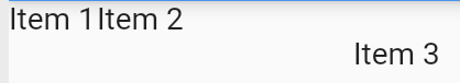
Column(
  children: [
    Row(
      children: [
        Text('Item 1'),
        Text('Item 2'),
      ],
    ),
    Text('Item 3'),
  ],
)
For more information on widgets, check out the Layout section.
Zapp: Format, ...
You can simply right-click inside the code window in Zapp and select "Format Document" to automatically format your code.
Layout
Try to implement a nice layout of your choice. Start simple.
4.3 User Input
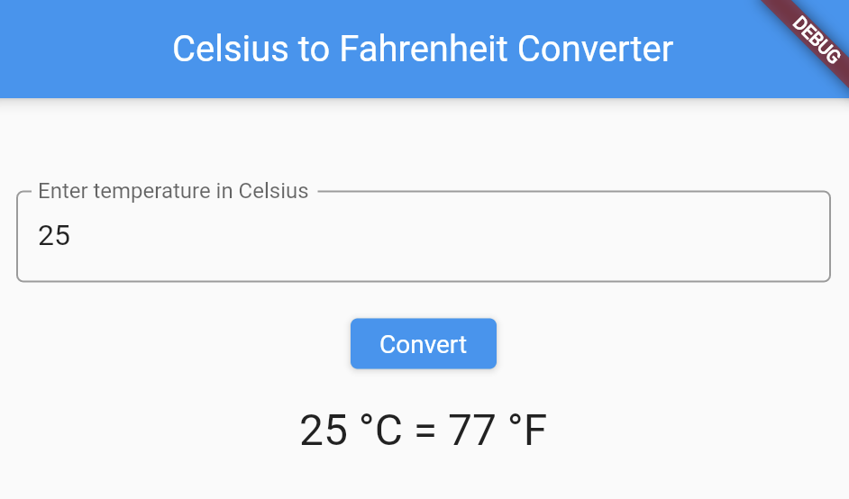
So far, we’ve built a simple counter app, which was fun! But what if we want to get input from the user and do something with it? For example, let’s build a simple Temperature Converter that takes a temperature in Celsius from the user and converts it to Fahrenheit.
When we create apps, we often need to ask the user to type something in or choose something. In Flutter, we can easily handle this with TextField widgets and buttons.
import 'package:flutter/material.dart';

void main() {
  runApp(const MyApp());
}

class MyApp extends StatelessWidget {
  const MyApp({super.key});

  @override
  Widget build(BuildContext context) {
    return MaterialApp(
      title: 'Demo Flutter App',
      theme: ThemeData(
        colorSchemeSeed: Colors.orange,
        useMaterial3: true,
        brightness: Brightness.light,
      ),
      darkTheme: ThemeData(
        colorSchemeSeed: Colors.purple,
        useMaterial3: true,
        brightness: Brightness.dark,
      ),
      home: const TemperatureConverterPage(title: 'Temperature Converter'),
      debugShowCheckedModeBanner: false,
    );
  }
}

class TemperatureConverterPage extends StatefulWidget {
  const TemperatureConverterPage({super.key, required this.title});
  final String title;

  @override
  State<TemperatureConverterPage> createState() => _TemperatureConverterPageState();
}

class _TemperatureConverterPageState extends State<TemperatureConverterPage> {
  // This creates a TextEditingController object that will be used to manage the text input in a TextField widget.
  final TextEditingController _controller = TextEditingController();
  String _result = '';

  void _convertTemperature() {
    // Get the Celsius value entered by the user
    double celsius = double.tryParse(_controller.text) ?? 0;
    double fahrenheit = (celsius * 9 / 5) + 32;
    // Change the state and hence trigger a redrawing of the UI, i.e. trigger a call of the method build
    setState(() {
      _result = '$celsius °C = $fahrenheit °F';
    });
  }

  @override
  Widget build(BuildContext context) {
    return Scaffold(
      appBar: AppBar(
        title: Text(widget.title),
      ),
      body: Column(
        children: [
          TextField(controller: _controller),
          ElevatedButton(
            onPressed: _convertTemperature,
            child: Text('Convert'),
          ),
          Text(_result),
        ],
      ),
    );
  }
}
- TextField: This is where the user enters their input. We use a
TextEditingControllerto get the text that the user types. - Button: When the user presses the Convert button, the
_convertTemperature()function is called. It reads the value from theTextField, converts it from Celsius to Fahrenheit, and displays the result. : - The result (the conversion) is displayed below the button in a
Textwidget.
Check the same program with a nicer UI
import 'package:flutter/material.dart';

void main() {
  runApp(const MyApp());
}

class MyApp extends StatelessWidget {
  const MyApp({super.key});

  @override
  Widget build(BuildContext context) {
    return MaterialApp(
      title: 'Demo Flutter App',
      theme: ThemeData(
        colorSchemeSeed: Colors.orange,
        useMaterial3: true,
        brightness: Brightness.light,
      ),
      darkTheme: ThemeData(
        colorSchemeSeed: Colors.purple,
        useMaterial3: true,
        brightness: Brightness.dark,
      ),
      home: const TemperatureConverterPage(title: 'Temperature Converter'),
      debugShowCheckedModeBanner: false,
    );
  }
}

class TemperatureConverterPage extends StatefulWidget {
  const TemperatureConverterPage({super.key, required this.title});
  final String title;

  @override
  State<TemperatureConverterPage> createState() => _TemperatureConverterPageState();
}

class _TemperatureConverterPageState extends State<TemperatureConverterPage> {
  // This creates a TextEditingController object that will be used to manage the text input in a TextField widget.
  final TextEditingController _controller = TextEditingController();
  String _result = '';

  void _convertTemperature() {
    // Get the Celsius value entered by the user
    double celsius = double.tryParse(_controller.text) ?? 0;
    double fahrenheit = (celsius * 9 / 5) + 32;
    // Change the state and hence trigger a redrawing of the UI, i.e. trigger a call of the method build
    setState(() {
      _result = '$celsius °C = $fahrenheit °F';
    });
  }

    // just the ui part, everything else as before
  @override
  Widget build(BuildContext context) {
    return MaterialApp(
      home: Scaffold(
        appBar: AppBar(
          title: Text('Celsius to Fahrenheit Converter'),
        ),
        body: Padding(
          padding: const EdgeInsets.all(16.0),
          child: Column(
            mainAxisAlignment: MainAxisAlignment.center,
            children: [
              TextField(
                controller: _controller,
                keyboardType: TextInputType.number,
                decoration: InputDecoration(
                  labelText: 'Enter temperature in Celsius',
                  border: OutlineInputBorder(),
                ),
              ),
              SizedBox(height: 20),
              ElevatedButton(
                onPressed: _convertTemperature,
                child: Text('Convert'),
              ),
              SizedBox(height: 20),
              Text(
                _result,
                style: TextStyle(fontSize: 24),
              ),
            ],
          ),
        ),
      ),
    );
  }
}
User Input
Try to implement similar functions, e.g. a currency converter.
4.4 Principal Structure of Flutter Apps: Understanding What You're Doing
After exploring several examples, it's crucial to understand what you're actually doing when building Flutter applications. Let's examine the principal structure of Flutter apps, which follows a consistent pattern across all projects.
Every Flutter application, regardless of complexity, is built around these core components:
4.4.1 The Entry Point
void main() {
  runApp(const MyApp());
}
runApp() which inflates your root widget and attaches it to the screen.
4.4.2 The App Widget
class MyApp extends StatelessWidget {
  const MyApp({super.key});

  // This widget is the root of your application.
  @override
  Widget build(BuildContext context) {
    return MaterialApp(
      title: 'Flutter App!!',
      theme: ThemeData(
        colorSchemeSeed: Colors.indigo,
        useMaterial3: true,
        brightness: Brightness.light,
      ),
      darkTheme: ThemeData(
        colorSchemeSeed: Colors.blue,
        useMaterial3: true,
        brightness: Brightness.dark,
      ),
      home: const MyHomePage(title: 'Flutter Example App'),
      debugShowCheckedModeBanner: false,
    );
  }
}
- Defines the application's visual identity (themes, colors)
- Determines the initial screen (
home:) - May set up navigation infrastructure
- May configure system-wide behaviors
4.4.3 Screen Widgets
Flutter apps typically contain two types of widgets for screens:
Stateless Widgets - for UI elements that don't change
class InfoScreen extends StatelessWidget {
  @override
  Widget build(BuildContext context) {
    // Return unchanging UI
  }
}
Stateful Widgets - for screens with dynamic content
class InteractiveScreen extends StatefulWidget {
  @override
  State<InteractiveScreen> createState() => _InteractiveScreenState();
}
// This is a separate class that manages all the changing data for our InteractiveScreen
// The underscore (_) makes this class private - it can only be used in this file
class _InteractiveScreenState extends State<InteractiveScreen> {
  // Variables and state management
  int _counter = 0;

  void _incrementCounter() {
    // This call to setState tells the Flutter framework that something has changed in this State.
    setState(() {
      _counter++; //short form of _counter = _counter + 1;
    });
  }

  @override
  Widget build(BuildContext context) {
    // Return dynamic UI
  }
}
4.4.3.1 Build Method and setState Connection in Stateful Widgets
The relationship between the build method and setState is one of the most important concepts to understand in Flutter development. This connection forms the core of Flutter's reactive UI system.
setState is a special method provided by the State class that triggers UI updates and hence triggers a call of the build method
void _incrementCounter() {
  setState(() {
    _counter++;
  });
}
The build method and setState form a cycle that powers Flutter's reactive UI
- Initial build: When a StatefulWidget is first created, Flutter calls
buildto draw it. - State changes: When something happens (like a button press), you call
setState. - Rebuild triggered:
setStatetells Flutter that state has changed andbuildneeds to run again. - UI updates: Flutter calls
buildagain, which returns a new widget tree reflecting the updated state. - Efficient rendering: Flutter compares the old and new widget trees and updates only what changed.
4.4.4 Widget Composition: Building UIs by Nesting Widgets
Flutter's power comes from its compositional model. You build complex interfaces by nesting simpler widgets inside one another.
Let's examine the pattern of widget nesting in Flutter using a simple example
Container(
  child: Text('Hello World'),
)
In this example, we have two widgets
- An outer
Containerwidget - An inner
Textwidget
The inner widget (Text) is nested inside the outer widget (Container) through the child property. This creates a parent-child relationship between them.
4.4.4.1 Single-Child vs. Multi-Child Widgets
Flutter has two main categories of widgets when it comes to containing other widgets
-
Single-child widgets like
Containerhave achildproperty that accepts exactly one widgetContainer( child: Text('Hello'), // Can only have one child ) -
Multi-child widgets like
RowandColumnhave achildrenproperty that accepts a list of widgetsColumn( children: [ // Notice the plural "children" Text('First item'), Text('Second item'), Text('Third item'), ], )
4.4.4.2 Composition Tips
- Start from the outside: Begin with container widgets (Scaffold, Container)
- Add layout widgets: Use Row, Column, Stack to arrange elements
- Add visual elements: Text, Icons, Buttons as the innermost widgets
- Use spacing widgets: SizedBox, Padding, Spacer to create proper spacing
Understanding Dart Syntax in Flutter
4.4.5 Repetition: Dart Syntax and Structure
A class is a blueprint for creating objects that have specific properties and behaviors:
class MyHomePage {
  // Class contents go here
}
- A class acts like a container for related code
- Flutter widgets are classes that describe UI elements
A method is a function that belongs to a class and defines behavior:
void _incrementCounter() {
  // Code to execute goes here
}
- Methods use
()to receive parameters - Methods use
{}to contain their code blocks
Properties are variables that belong to a class
final String title;  // A property
int _counter = 0;    // Another property
- Properties store data for the class
- They end with semicolons
;
The extends keyword indicates inheritance - your class builds upon another class
class MyApp extends StatelessWidget {
  // MyApp gets all StatelessWidget capabilities
}
- This means your class has all the properties and methods of the parent class
- Flutter uses this to create widget hierarchies
4.4.5.1 When to use property: value with ,
Use this syntax for named parameters in constructors and functions
MaterialApp(
  title: 'My App',    // ← Named parameter with comma
  theme: ThemeData(   // ← Another named parameter
    primarySwatch: Colors.blue,
  ),
  home: MyHomePage(),  // ← Last item may have a trailing comma
);
- Each property-value pair represents a parameter
- Separated by commas
, - Trailing commas are optional but recommended for formatting
4.4.5.2 When to use parentheses ()
Use parentheses for
-
Method declarations and calls
void _incrementCounter() { /* code */ } // Declaration _incrementCounter(); // Method call -
Function parameters
ElevatedButton( onPressed: () { /* code */ }, // Function parameter child: Text('Press'), ) -
Grouping expressions
if (counter > 5) { /* code */ }
4.4.5.3 When to use curly braces {}
Use curly braces for 1. Code blocks
void _incrementCounter() {
  // Code block for a method
}
-
Anonymous functions (lambda expressions)
onPressed: () { setState(() { _counter++; }); }, -
Class bodies
class MyApp extends StatelessWidget {
  // Class body
}
4.4.5.4 When to use semicolons ;
Use semicolons
-
At the end of statements:
int counter = 0; _incrementCounter(); final message = 'Hello'; -
After property declarations
final String title; -
After method calls (but not method declarations)
setState(() { _counter++; });
4.4.6 Age Calculator with DatePicker
In this example, we'll introduce a very simple way for users to select their birthdate using a calendar. After they select a date, the app will automatically calculate their age based on the current date.
import 'package:flutter/material.dart';

void main() {
  runApp(const MyApp());
}

class MyApp extends StatelessWidget {
  const MyApp({super.key});

  @override
  Widget build(BuildContext context) {
    return MaterialApp(
      title: 'Demo Flutter App',
      theme: ThemeData(
        colorSchemeSeed: Colors.orange,
        useMaterial3: true,
        brightness: Brightness.light,
      ),
      darkTheme: ThemeData(
        colorSchemeSeed: Colors.purple,
        useMaterial3: true,
        brightness: Brightness.dark,
      ),
      home: const MyHomePage(title: 'Age Calculator'),
      debugShowCheckedModeBanner: false,
    );
  }
}

class MyHomePage extends StatefulWidget {
  const MyHomePage({super.key, required this.title});
  final String title;

  @override
  State<MyHomePage> createState() =>
      _MyHomePageState();
}

class _MyHomePageState extends State<MyHomePage> {
  DateTime? _selectedDate;
  String _age = '';

  // Function to show the date picker
  Future<void> _pickDate() async {
    final DateTime? picked = await showDatePicker(
      context: context,
      initialDate: DateTime.now(), // Default to the current date
      firstDate: DateTime(1900), // Earliest date
      lastDate: DateTime.now(), // Latest date
    );

    if (picked != null && picked != _selectedDate) {
      setState(() {
        _selectedDate = picked;
        _calculateAge();
      });
    }
  }

  void _calculateAge() {
    if (_selectedDate == null) return;
    DateTime currentDate = DateTime.now();
    int age = currentDate.year - _selectedDate!.year;
    // Adjust if the birthday hasn't occurred yet this year
    if (currentDate.month < _selectedDate!.month ||
        (currentDate.month == _selectedDate!.month &&
            currentDate.day < _selectedDate!.day)) {
      age--;
    }
    // set the state and hence trigger refreshing the ui
    setState(() {
      _age = 'Your age is $age years';
    });
  }

  @override
  Widget build(BuildContext context) {
    return Scaffold(
      body: Column(
        mainAxisAlignment: MainAxisAlignment.center,
        children: [
          IconButton(icon: Icon(Icons.calendar_today), onPressed: _pickDate),
          Text(_age),
        ],
      ),
    );
  }
}
4.5 Simple Shopping List
We want to implement a simple shopping list.
import 'package:flutter/material.dart';

// Define the shopping list globally
List<String> shoppingList = [
  'Lipstick',
  'T-shirt',
  'Hairband',
];

void main() {
  runApp(MyApp());
}

class MyApp extends StatelessWidget {
  @override
  Widget build(BuildContext context) {
    return MaterialApp(
      home: ShoppingListScreen(),
    );
  }
}

class ShoppingListScreen extends StatefulWidget {
  @override
  _ShoppingListScreenState createState() => _ShoppingListScreenState();
}

class _ShoppingListScreenState extends State<ShoppingListScreen> {
  @override
  Widget build(BuildContext context) {
    return Scaffold(
      appBar: AppBar(
        title: Text('Shopping List'),
      ),
      body: ListView.builder(
        itemCount: shoppingList.length,
        itemBuilder: (context, index) {
          return ListTile(
            title: Text(shoppingList[index]),
          );
        },
      ),
    );
  }
}
- We define a list of strings called
shoppingListglobally outside of any class. It contains three items:Lipstick,T-shirt, andHairband. - We display the shopping list using a
ListView.builder(). This allows the list to scroll if there are more items.
4.5.1 Add an Item to the List
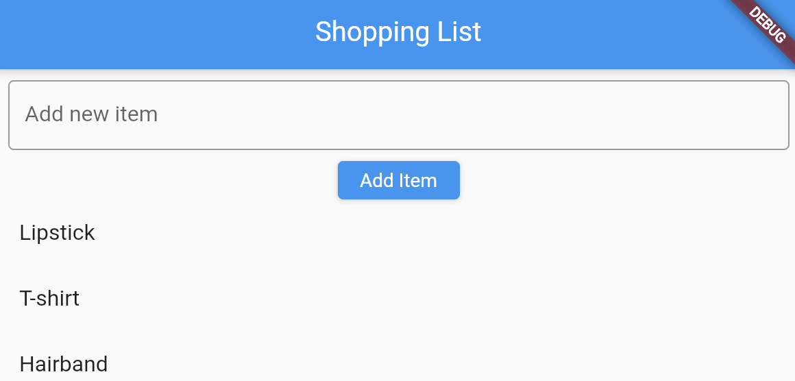 Next, we'll allow the user to add an item to the shopping list. To do this, we will add a simple TextField and a Button to submit the new item. We also need a StatefulWidget, because the list will change dynamically, and we need to update the ListView whenever the list changes.
import 'package:flutter/material.dart';

// Define the shopping list globally
List<String> shoppingList = [
  'Lipstick',
  'T-shirt',
  'Hairband',
];

void main() {
  runApp(MyApp());
}

class MyApp extends StatelessWidget {
  @override
  Widget build(BuildContext context) {
    return MaterialApp(
      home: ShoppingListScreen(),
    );
  }
}

class ShoppingListScreen extends StatefulWidget {
  @override
  _ShoppingListScreenState createState() => _ShoppingListScreenState();
}

class _ShoppingListScreenState extends State<ShoppingListScreen> {
  final TextEditingController _controller = TextEditingController();

  // Function to add item to the list
  void _addItem() {
    setState(() {
      shoppingList.add(_controller.text);
    });
    _controller.clear(); // Clear the input field
  }

  @override
  Widget build(BuildContext context) {
    return Scaffold(
      appBar: AppBar(
        title: Text('Shopping List'),
      ),
      body: Column(
        children: [
          Padding(
            padding: const EdgeInsets.all(8.0),
            child: TextField(
              controller: _controller,
              decoration: InputDecoration(
                hintText: 'Add new item',
                border: OutlineInputBorder(),
              ),
            ),
          ),
          ElevatedButton(
            onPressed: _addItem,
            child: Text('Add Item'),
          ),
          Expanded(
            child: ListView.builder(
              itemCount: shoppingList.length,
              itemBuilder: (context, index) {
                return ListTile(
                  title: Text(shoppingList[index]),
                );
              },
            ),
          ),
        ],
      ),
    );
  }
}
4.5.2 Swipe to Delete Items
Now, let’s introduce swipe-to-delete. We'll wrap the ListTile with a Dismissible widget, which will allow users to swipe left or right to remove an item.
import 'package:flutter/material.dart';

// Define the shopping list globally
List<String> shoppingList = [
  'Lipstick',
  'T-shirt',
  'Hairband',
];

void main() {
  runApp(MyApp());
}

class MyApp extends StatelessWidget {
  @override
  Widget build(BuildContext context) {
    return MaterialApp(
      home: ShoppingListScreen(),
    );
  }
}

class ShoppingListScreen extends StatefulWidget {
  @override
  _ShoppingListScreenState createState() => _ShoppingListScreenState();
}

class _ShoppingListScreenState extends State<ShoppingListScreen> {
  final TextEditingController _controller = TextEditingController();

  void _addItem() {
    setState(() {
      shoppingList.add(_controller.text);
    });
    _controller.clear(); // Clear the input field
  }

  // Function to handle item removal
  void _removeItem(int index) {
    setState(() {
      shoppingList.removeAt(index);
    });
  }

  @override
  Widget build(BuildContext context) {
    return Scaffold(
      appBar: AppBar(
        title: Text('Shopping List'),
      ),
      body: Column(
        children: [
          Padding(
            padding: const EdgeInsets.all(8.0),
            child: TextField(
              controller: _controller,
              decoration: InputDecoration(
                hintText: 'Add new item',
                border: OutlineInputBorder(),
              ),
            ),
          ),
          ElevatedButton(
            onPressed: _addItem,
            child: Text('Add Item'),
          ),
          Expanded(
            child: ListView.builder(
              itemCount: shoppingList.length,
              itemBuilder: (context, index) {
                return Dismissible(
                  key: Key(shoppingList[index]), // Unique key for each item
                  onDismissed: (direction) {
                    _removeItem(index); // Remove the item when swiped
                    ScaffoldMessenger.of(context).showSnackBar(
                      SnackBar(content: Text('Item removed')),
                    );
                  },
                  child: ListTile(
                    title: Text(shoppingList[index]),
                  ),
                );
              },
            ),
          ),
        ],
      ),
    );
  }
}
- We wrapped the
ListTilewith theDismissiblewidget, which allows users to swipe left or right to delete an item. - The
onDismissedcallback is triggered when the item is swiped, and it calls the_removeItem()function to remove the item from the list. - After the item is deleted, we show a SnackBar as a small message at the bottom to confirm that the item was removed.
ToDo-List
Instead of a shopping list, implement a todo list. Adapt the layout to your needs.
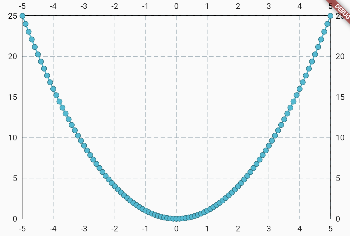
4.6 Painting Mathematical Functions
This example will focus on a simple function plotting scenario, where we plot a mathematical function like (y = x^2) (a basic parabola), and allow the user to see how the function is visualized on the screen.
 We will use the library fl_chart. To use the fl_chart package in your Flutter project, you need to first add it to your pubspec.yaml file under dependencies.
Open the pubspec.yaml file and make sure to add fl_chart just below the cupertino_icons package (or wherever you want, but usually it’s under the dependencies section).
dependencies:
  flutter:
    sdk: flutter
  cupertino_icons: ^1.0.2  # This is usually already there
  fl_chart: any
flutter pub get in the terminal.
import 'package:flutter/material.dart';
// to be able to use the chart in the code we need to import it
import 'package:fl_chart/fl_chart.dart';

void main() {
  runApp(MyApp());
}

class MyApp extends StatelessWidget {
  @override
  Widget build(BuildContext context) {
    return MaterialApp(
      home: Scaffold(
        body: ParabolaChart(),  // Our custom widget that displays the parabola chart
      )
    );
  }
}

class ParabolaChart extends StatelessWidget {
  @override
  Widget build(BuildContext context) {
    return LineChart(
      LineChartData(
        // Controls grid lines' appearance in the background
        gridData: FlGridData(show: true),
        // Data for the line chart (the parabola)
        lineBarsData: [
          LineChartBarData(
            spots: _generateParabolaPoints(),  // Points to plot on
          ),
        ],
      ),
    );
  }

  // This function generates the points for the parabola (y = x^2)
  List<FlSpot> _generateParabolaPoints() {
    List<FlSpot> spots = [];  // List to hold the points of the parabola
    for (double x = -5; x <= 5; x += 0.1) {
      double y = x * x;
      spots.add(FlSpot(x, y));  // Add each (x, y) point to the list
    }
    return spots;
  }
}
Functions
Plot another function, change the interval, and adjust the step size.
Pie Chart
Use the pie chart of fl_chart.
4.7 Navigation
Most apps feature a bottom navigation bar for easy navigation between different sections. Here's a simple example that implements a bottom navigation bar, where one page shows a counter and the other displays a list with detailed navigation.
Here’s the code. Copy it into Zapper, run it, explore how it works, and feel free to modify it as needed.
import 'package:flutter/material.dart';

void main() {
  runApp(MyApp());
}

class MyApp extends StatelessWidget {
  @override
  Widget build(BuildContext context) {
    return MaterialApp(
      // Set the home screen of the app
      home: MyHomePage(),
    );
  }
}

class MyHomePage extends StatefulWidget {
  @override
  _MyHomePageState createState() => _MyHomePageState();
}

class _MyHomePageState extends State<MyHomePage> {
  // This variable keeps track of the selected tab in the BottomNavigationBar
  int _selectedIndex = 0;

  // List of items to display in the ListScreen
  final List<String> _items = List.generate(20, (index) => 'Item $index');

  // This method handles the BottomNavigationBar tab change
  void _onItemTapped(int index) {
    setState(() {
      _selectedIndex = index;
    });
  }

  // Private method to return the selected screen based on the _selectedIndex
  Widget _getSelectedScreen() {
    if (_selectedIndex == 0) {
      return CounterScreen();
    } else {
      return ListScreen(items: _items);
    }
  }

  @override
  Widget build(BuildContext context) {
    return Scaffold(
      // Display different screens based on the selected tab
      body: _getSelectedScreen(), // Using the private method here

      // BottomNavigationBar to navigate between screens
      bottomNavigationBar: BottomNavigationBar(
        currentIndex: _selectedIndex,
        onTap: _onItemTapped, // Call this method when a tab is tapped
        items: const <BottomNavigationBarItem>[
          BottomNavigationBarItem(
            icon: Icon(Icons.add),
            label: 'Counter', // First tab for the counter
          ),
          BottomNavigationBarItem(
            icon: Icon(Icons.list),
            label: 'List', // Second tab for the list
          ),
        ],
      ),
    );
  }
}

// Counter Screen with FloatingActionButton
class CounterScreen extends StatefulWidget {
  @override
  _CounterScreenState createState() => _CounterScreenState();
}

class _CounterScreenState extends State<CounterScreen> {
  // The counter variable to keep track of the value
  int _counter = 0;

  // Method to increment the counter when the button is pressed
  void _incrementCounter() {
    setState(() {
      _counter++;
    });
  }

  @override
  Widget build(BuildContext context) {
    return Scaffold(
      appBar: AppBar(title: Text('Counter')),

      // Display the counter value in the center of the screen
      body: Center(
        child: Text('Counter: $_counter', style: TextStyle(fontSize: 24)),
      ),

      // FloatingActionButton that increments the counter
      floatingActionButton: FloatingActionButton(
        onPressed: _incrementCounter, // Call _incrementCounter when pressed
        child: Icon(Icons.add), // Icon for the floating action button
      ),
    );
  }
}

// List Screen with navigation to the details screen
class ListScreen extends StatelessWidget {
  final List<String> items;

  // Constructor to pass the list of items to the ListScreen
  ListScreen({required this.items});

  @override
  Widget build(BuildContext context) {
    return Scaffold(
      appBar: AppBar(title: Text('Item List')),

      // ListView to display a list of items
      body: ListView.builder(
        itemCount: items.length, // Number of items in the list
        itemBuilder: (context, index) {
          return ListTile(
            title: Text(items[index]), // Display the item name
            onTap: () {
              // Navigate to the details screen when an item is tapped
              Navigator.push(
                context,
                MaterialPageRoute(
                  builder: (context) => DetailsScreen(item: items[index]),
                ),
              );
            },
          );
        },
      ),
    );
  }
}

// Details Screen without Bottom Navigation
class DetailsScreen extends StatelessWidget {
  final String item;

  // Constructor to pass the selected item to the DetailsScreen
  DetailsScreen({required this.item});

  @override
  Widget build(BuildContext context) {
    return Scaffold(
      appBar: AppBar(title: Text('Details')),

      // Display the details for the selected item in the center
      body: Center(
        child: Text('Details for $item', style: TextStyle(fontSize: 24)),
      ),
    );
  }
}
For more complex apps and to preserve the state of a page (e.g. counter) it might be reasonable to use the lib go_router. A well described example may be found here Flutter Bottom Navigation Bar with Stateful Nested Routes using GoRouter.
4.8 Games
Flame is a game engine built on top of Flutter. It is lightweight and makes it easy to create 2D games. Flame simplifies many complex game development tasks, such as handling animations, sprites, and physics.
Flame: Local
Since Flame is still in development, many new features may not be available in Zapp. Therefore, it's recommended to use a local installation for developing games in Flutter.
Create a new blank Flutter project and, run the following command in your project's terminal (make sure you're in the project directory where your pubspec.yaml file is located):
flutter pub add flame
You should see something like this in pubspec.yaml:
dependencies:
  flame: any
Understand the Game Widget - a component used to integrate a game into any Flutter app - and the Game Loop, which automatically invokes methods for players and other game objects while rendering the screen frame by frame.
Explore the zapp example. Continue with the TRex Jump and Run
- Game, examples->T-Rex
- Explanation of the code
- Source Code und download, in zip file check examples/games/trex
- Adapt the game, change the obstacle, change the player, add a background ....
Then, choose one of the tutorials Flame Tutorials and start coding.
For each line or block of code you don't understand, ask any AI, such as ChatGPT, Perplexity, github copilot, etc., using prompts like
Please be my motivating tutor and explain the following code, line by line.
Help me understand the overall picture, and use analogies that are easy to relate to for a teenager where appropriate.
Keep the tone encouraging and make sure I can follow along easily.
4.9 Build
You can create Windows executables and more. To do so, run the command in the terminal; you will find the output in the build folder of your project.
flutter build windows
flutter build web
flutter build apk
Read Building macOS apps with Flutter to build for macOS.
4.10 Next Steps
Great! Now you're ready to follow Google's official Flutter learning path and Codelabs or start building your own app. Feel free to use my detailed material on Flutter and Human-Computer Interaction to deepen your understanding. You can also explore the documentation and resources like the cookbook to learn on demand and gain practical experience.