2. UX
User Experience (UX) design is all about making sure digital products are not only beautiful but also work smoothly for the people who use them.
2.1 Paper Prototypes
Before diving into the computer, UX designers often begin with paper prototypes - simple hand-drawn sketches that help visualize ideas quickly. It's like planning out a room layout on paper before moving in the furniture.
Sketching helps you try out different designs without worrying about small details. It's a chance to experiment and find what works best.
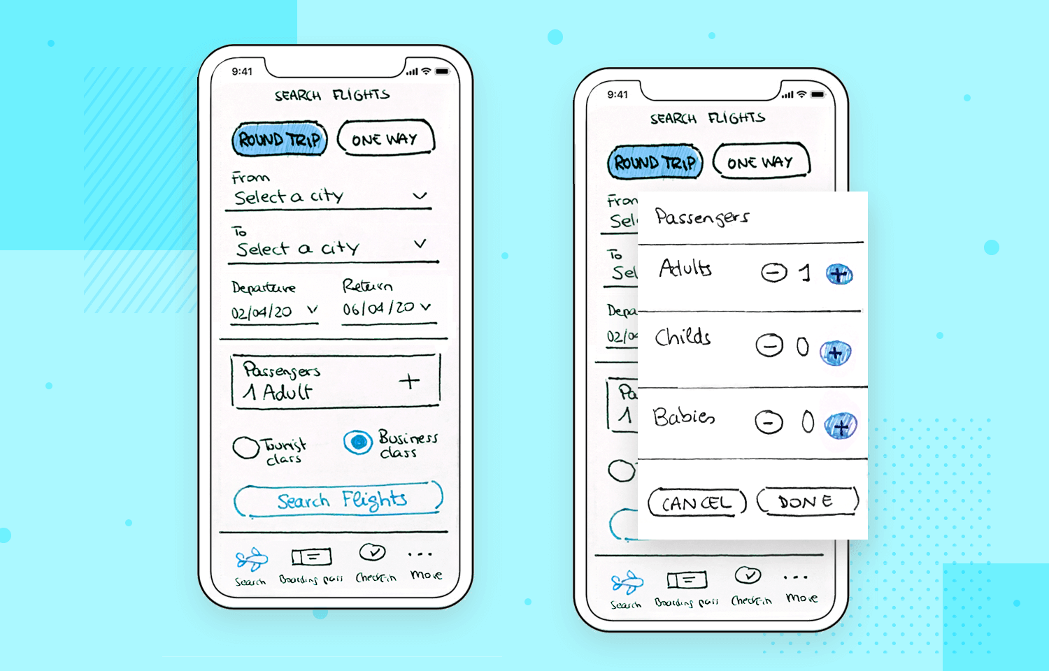
paper prototype
- Grab a piece of paper and a pen.
- Design a simple screen for a music app (e.g., buttons for play, pause, skip).
- Try different ways to arrange the buttons. Which one looks the easiest to understand?
2.2 Figma
Now, let's dive into Figma, a tool that helps you design beautiful, interactive prototypes. Figma lets you create, share, and test digital designs right from your browser!
2.2.1 Jump Start
Tip
As you read, open Figma and follow along with what you're learning!
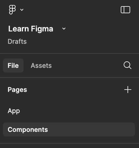
First, create an account and start a new design project. You’ll need to create two pages: one for your components (like buttons and icons) and another for your app itself. Think of these pages like separate files, not just different pages of your app.
On the main screen, press the f key to create a frame. Then, on the right side, choose a device preset to match the screen size you're designing for. Frames are like containers that help organize everything in your design, such as shapes, images, and text, into a clean and organized layout.
We’ll start with colors and components. Add a frame to the components page.
Add three circles and pick 3 main colors: one for accents, one for the background, and one for text. Add more colors if you need them. You can use a color palette from Coolors.
Next, define your components, like buttons and icons. Anything that you'll use more than once, and that only changes in the text, should be made into a component. A component is a reusable element. Once you design something, like a button, you can turn it into a component and use it throughout your design. It's like having a favorite LEGO piece you can use over and over again!
Keep the navigation simple because the programming is straightforward and doesn’t need too much design.
Now, move on to the frame on your app page. Start adding your components, and then add rectangles and circles to match the design from your paper prototype. Use layout grids to make sure everything is aligned properly.
2.2.2 Prototypes
Prototypes are where Figma gets really fun! A prototype is a clickable version of your design. It lets you test your design like it's a real app by clicking through buttons and screens. However, it is still a prototype, no logic, no data, no real app.
Your Idea
Create the frames for your app step by step and build a clickable prototype in Figma.
User Test
Test your prototype with others by giving them a task to complete, with minimal explanation. Observe where they hesitate or struggle, then adjust the interaction or icon to make it more intuitive.
Designing is like solving puzzles - each piece you add makes the whole experience better! Don’t worry if your designs aren’t perfect at first; just keep practicing and experimenting. The more you design, the more you’ll improve!
As you learn more about UX and Figma, you’ll get even better at creating cool, interactive designs. Keep thinking about how your designs can make life easier and more fun for others. 🎉